For my machine-stitch design, the last thing to do was to determine which lines I would stitch from the pylon photo. Luckily at college there were some giant pieces of tracing paper and I just traced off the ones I wanted. It's amazing how curved the lines actually are even though they are straight pieces of metal! I guess that's the effect of perspective and camera distortion. As a result I feel I need to copy the same lines to get the perspective effect and to ensure that it looks 'real' and not too perfect.
The purple lines are the horizontal structures that carry the electricity wires at the top of the pylon, which I have simplified out. I am going to stitch them in a paler colour to make them recede. I have also omitted some of the electricity cables as they didn't work.
Then I started on some samples. First I stitched some random lines on dissolvable fleece in metallic threads and different coloured bobbin threads using free-machining. This is quite easy to do once you have got the thread started as long you make sure the stitches overlap. I was generally stitching in horizontal lines so I needed to make sure I looped back up the rows above otherwise it would all fall apart when the fabric was dissolved.
A quick rinse under hot water and ironed dry between 2 tea towels. You can see that not all my rows linked together enough.
Then I decided to see if I could reproduced a section of my design successfully. I masked off this area as it had most of the colours in and was also an interesting section of the lines to stitch because the centre is on the right at the bottom of the yellow part.
I cut a pale blue piece to cover the whole area as my backing piece. Then I layered on strips of the other colours, roughly cut to shape to mimic the colours I saw in the design. My sample last week taught me that the chiffons are bold and difficult to integrate so I tried to partially shape and fray them at this stage.
I also incorporated some small sections of fused Angelina fibre behind the top layer. I wanted to put some of the machine-lace I made above in on the yellow section, top right, to mimic the blue spotty bits in the design but was unsure how I would fray the fabric below so in the end I left it out.
Next I cut a piece of Soluvlies to size and traced off the lines for this section of the design. The Soluvlies is fairly transparent and I had gone over my tracing with a thick felt-tip so this was quite easy. I traced the lines with pencil, however, as I didn't want any ink to bleed onto my finished sample when I dissolved the fleece.
I pinned it down and stitched the lines. I started with the purple lines as they are supposed to be the most distant. It didn't sew as well as I hoped, initally, but got a lot better as I added more rows. I think in my final piece I may have to put more layers of pale organza on the back to make it thicker.
I did the vertical lines first and then the horizontal ones. By the time I got to the latter I had realised that it looked a lot better if I could start with a narrow stitch width and then get gradually bigger.
Here it is after washing the dissolvable fabric away completely. I am really pleased with the richness and variations in colour.
The stitching the centre didn't work very well so I will have to try again on this. The wide diagonal lines would look too messy if I tried to satin stitch them so my intention is to bond some strips of dark blue fabric on for them and just stitch up the edges.
Here it is after cutting and fraying the relevant areas. The really sparkly areas have Angelina behind so that worked well. I am very pleased with the result and have learnt a lot from making this sample.
I have also been progressing my hand-stitch. My goal this week was to finish the Dandelion but I have also managed to do the stem and leaves of the Goosegrass too.
The Dandelion stalks took forever and are not that neat - satin-stitch needs a lot of skill and patience.
I enjoyed doing the octagonal trellis blackwork pattern on the flower head but wonder if it is too much now that it is complete. Compared to my design the overall effect is darker and I may have lost something in the overall composition as a result. I'm not changing it though!
The Goosegrass was relatively quick and easy by comparison. The stem is multiple rows of Stem stitch and the leaves are just 3 rows of Straight stitch, all sewn with 3 strands of embroidery floss.
Finally, I went to an event at Brockenhurst Village Hall in the New Forest yesterday and saw this hanging (below) that the local quilters had made about the village!
Monday, April 30, 2012
Monday, April 23, 2012
Week 24 - Reverse applique and machine-stitch design
Having got my hand-stitch design finalised, I turned my attention to my final machine-stitch piece this week. I wanted to use the pylon design that I have included in both my line design and shape design books. My concept is that looking up through the middle of the pylon is like looking through a stained glass window of the sky. I want to make the whole piece in sheer fabrics that give subtle variations in colour as they are layered and cut through plus I could incorporate some pieces of machine-lace created by free-machining on dissolvable fabric.
My tutor approved the concept and gave me some things to think about, such as if it is a window hanging, identify the window it will hang in and make it to the right size!
I had the pylon image so I needed to create the sky design. I experimented with Brusho on wet tracing paper - not a success - before going back to lining paper.
I dampened it all over and then brushed on blues, yellows, orange and red. I had a couple of goes at college but I didn't think they were quite right so I came home a researched dramatic sky images on the internet. The one top right on the left hand piece of paper was the one I chose for inspiration.
I had another go and this is the result. It is approx 80cm square so I had to join the lining paper.
I now have the tricky job of marking on the pylon lines and with it the next lot of decisions - do I faithfully reproduce the lines of varying thicknesses or do I simply represent them? Do I simplify it by missing out some of the lines? Do I want to put in the finer wires and other intricate details for interest? Next week's blog will show how I resolve all these points.
We also learnt a new technique at college called reverse applique. Normally you layer up various fabrics, the grottier and unpromising the better, machine stitch shapes or patterns through all layers and then using small sharp scissors cut through the layers, close to your stitch lines, to reveal different and unexpected colours in your shapes.
As this technique seemed close to what I wanted to do with my pylon piece I chose to give it a go with some of the sheer fabrics I have bought to test it out and use it as one of my samples.
There are 3 blue 20cm squares in this stack plus some other pieces cut into random shapes and layered haphazardly, including a piece of gold lace. I sewed geometric lines using a medium satin stitch. Above shows the front and right the back.
Then I started cutting away layers from the front or back or both. At first I just cut whole areas away around the edge. However, as I got into the middle this was harder to do so I started cutting frayed holes, sometimes cutting colours below away completely.
This is the result photographed against a piece of white fabric rather than on the window, although I like the effect against the window too.
It is quite painterly so I should be able to get a good sky effect using this technique. I like the dark blue thread I used instead of black.
Things to consider are:
My tutor approved the concept and gave me some things to think about, such as if it is a window hanging, identify the window it will hang in and make it to the right size!
I had the pylon image so I needed to create the sky design. I experimented with Brusho on wet tracing paper - not a success - before going back to lining paper.
I dampened it all over and then brushed on blues, yellows, orange and red. I had a couple of goes at college but I didn't think they were quite right so I came home a researched dramatic sky images on the internet. The one top right on the left hand piece of paper was the one I chose for inspiration.
I had another go and this is the result. It is approx 80cm square so I had to join the lining paper.
I now have the tricky job of marking on the pylon lines and with it the next lot of decisions - do I faithfully reproduce the lines of varying thicknesses or do I simply represent them? Do I simplify it by missing out some of the lines? Do I want to put in the finer wires and other intricate details for interest? Next week's blog will show how I resolve all these points.
We also learnt a new technique at college called reverse applique. Normally you layer up various fabrics, the grottier and unpromising the better, machine stitch shapes or patterns through all layers and then using small sharp scissors cut through the layers, close to your stitch lines, to reveal different and unexpected colours in your shapes.
As this technique seemed close to what I wanted to do with my pylon piece I chose to give it a go with some of the sheer fabrics I have bought to test it out and use it as one of my samples.
There are 3 blue 20cm squares in this stack plus some other pieces cut into random shapes and layered haphazardly, including a piece of gold lace. I sewed geometric lines using a medium satin stitch. Above shows the front and right the back.
Then I started cutting away layers from the front or back or both. At first I just cut whole areas away around the edge. However, as I got into the middle this was harder to do so I started cutting frayed holes, sometimes cutting colours below away completely.
This is the result photographed against a piece of white fabric rather than on the window, although I like the effect against the window too.
It is quite painterly so I should be able to get a good sky effect using this technique. I like the dark blue thread I used instead of black.
Things to consider are:
- I need to decide whether I want to treat the sky as a whole image or create the impression of sky almost shape by shape
- The chiffons (orange and dark blue for example) are bolder than the other types of sheer so I need to use them carefully
- I had planned to make the whole piece with dissolvable fabric on the top to add stability and also allow me to draw on the pylon stitch lines. However, dissolvable fabric can leave a residue after you have washed it off which could ruin the lovely frayed edges so I will have to sample that too. I also did not experience any difficulty with machining the sheers on this sample.
I have not progressed any of my hand-stitch piece this week - I have been doing some of the written research that we have to present along-side both final pieces (research on 3 british designer-makers plus narrative on our design and sampling processes/results, final costings, health and safety considerations and final analysis on completion).
Monday, April 16, 2012
Week 23/Easter Break - Progressing hand-stitch piece
| Bought blue linen |
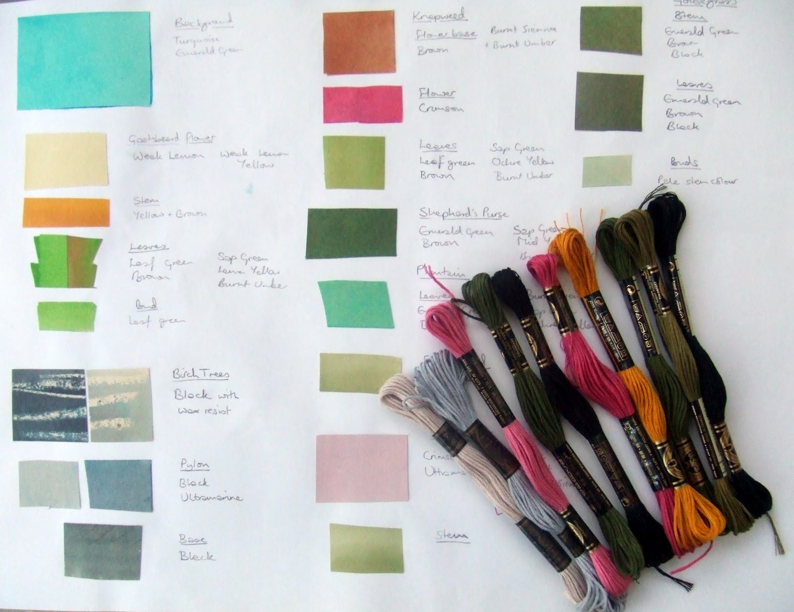
I laid all the cut pieces out with some of the embroidery threads on both backgrounds and took a photo. When I compared them side-by-side I felt that the colour of the painted piece 'lifted' the composition more. The bought linen was also quick thick and I was concerned whether the edge would show through the leaves and stems on top too much.
| Painted blue linen |
I sewed a running stitch line around the edge first to indicate the intended finished size (A3) and then bonded the blue strip on in position with Bondaweb. The ends extend beyond the running stitch line and I oversewed them with a small zig-zag to stop them fraying as I was completing the whole piece. However, I left the vertical edges un-sewed, relying on the Bondaweb to stop it fraying.
Next I traced off the main elements of the design by sticking my artwork on the window and the background on top with masking tape and pencilling in the lines.
I then covered the edges of the white linen with masking tape to stop them fraying and backed the whole piece with a layer of white cotton. This supports the looser weave linen and makes the white area whiter. It is also handy for starting off and finishing threads as you can 'hide' them between the layers.
Finally I bonded on the trees, purple flowers and big leaves to start with before mounting it onto the frame. You can buy wooden frames that are made up of pairs of sticks with interlocking ends in a variety of sizes, all interchangeable. It is a very good product and so far has worked well. I stretched the fabric, folded the ends under and attached it with drawing pins. It was easier than I thought it was going to be and I haven't had one incident of the thread getting caught round a drawing pin yet!
At last I was ready to start sewing. I have discovered that it takes a long time do sew something as precise as this. Before every element I have to decide which stitch and how many strands of floss I will use. I have done more samples where necessary to check out the technique or compare different effects.
I have researched different repetitive blackwork patterns for the flower heads.
I am going with Octagonal Trellis for the Dandelion head.
I have developed a vertical version of the Dark Fern Pattern for my Knapweed heads and a patterns of squares, sewn on the diagonal, for the Plantain heads. Each diamond has a tiny French Knot in the centre. After sampling I have decided that the patterns look best sewn in a single strand of embroidery floss.
This is as far as I have got. The Shepherd's Purse on the left is complete. The stems are Stem Stitch, the veins on the leaves are Backstitch. The patterns on the seeds are Straight Stitch and French Knots. The flowers are Bullion Knots outlined in Backstitch.
The Knapweed is complete apart from the pink tufts of petals (see samples above). The stems are in a thicker Stem Stitch and the leaf veins are Backstitch.
The Plantain is complete apart from the halo of white flowers (see samples above). The stems are in Stem Stitch and the leaf veins in Running Stitch.
The Dandelion leaves are finished - next the stems. The elements start getting progressively harder from now on as there is less reliance on filling in bonded shapes and more embroidery of whole plants.
So far I reckon I have spent 35 hours on it, not including the design. I am enjoying the challenge of it but it is physically tiring, on the eyes and the shoulders especially.
Tuesday, March 27, 2012
Week 22 - Preparing samples
As we are not allowed to use Brusho to colour our fabric for the final piece (because it is not light-fast) I now have to work out how to achieve these colours using acrylic paints.
Getting the colours right was not too hard but painting the fabric so that it didn't streak too much was. These samples are on cotton, linen and evenweave canvas. I have decided to use linen for the background and leaves and evenweave for the blackwork flower heads.
I have also been creating stitch samples to try out the different stitches and techniques. You just have to do enough to prove to yourself that you like or don't like the effect you are getting.
The bit I still have to focus on is getting the birch trees right. Although I like the stitch sample on the right, the black is too strong so I need to have another go with more muted greys.
This weekend a few of us from college went to the Art and Craft Show as Owlesbury - a village the far side of Winchester. Our class support from college, Alison, was demonstrating the use of her embellishing machine. This is a machine with 12 barbed needles and no thread. It rapidly meshes the fibres of the threads and fabrics together in a kind of machine needle felt.
I bought one of her cards - see left.
There was lots of other textile art on display.
| Quilt inspired by Matisse by Sue Chapman, a lecturer at Eastleigh College |
Monday, March 19, 2012
Week 21 - Designing first final piece
At college this week we started to design our final hand-stitch piece. It had to be based on something that we referenced or created in our zig-zag line book last November. From what I had done my choices were something based on my pylon page, the Large Hadron Collider (LHC) at Cerne or something based on Angie Lewin's Birches print. I think that the pylon is more suited to machine stitching and I couldn't find any good quality images for the LHC when I was putting the book together so I opted for the Angie Lewin influence. She is a print maker who creates pictures of the natural world in a very stylised way with 50's era colours. I like the way with her work that you can still tell what the plants are as she is good at capturing their habit.
I started by selecting some common wasteland plants and sketching them out of identification books to understand their habit.
I chose Plantain, Knapweed, Goatsbeard, Goosegrass, Cow Parsley and Shepherd's Purse. They all have different habits and distinctive characteristics. They are also all ones that Angie Lewin has captured in her prints.
Then I created a composition to put them all together. This in an A3 pad and I have ruled 2 wide margins either side to make the central panel tall and thin. In the background I have put silver birch trunks on the right and the foot of a pylon on the left. I went walking with my Dad to take a photo of the foot of a pylon growing in a field to see what this looked like!
Next I had to create a full colour mock-up of the piece to demonstrate to my tutor which colours I was going to use. I painted pieces of lining paper with Brusho and then collaged the whole piece. The silver birch trunks are created by rubbing a candle across the paper before applying the wash of black Brusho to resist it and create the stripes.
This is as far as I have got and it has taken me ages. I am not sure that I have got the background colour quite right and I am also not sure whether I will include the pylon in the finished piece as I think there is a danger if it all being too busy.
The embroidery is shown in black pen - some stems and patterns of stitches on the flowers and leaves. Angie Lewin's treatment of flower heads reminds me of free-form Blackwork embroidery so this is what I am aiming at.
I am pleased with the way I have captured the plants - you can still identify what they are.
The next stage is to choose some fabric and threads and work out how I am going to construct this piece.
I have completed my stitch challenge. This was a free-form piece of hand-stitch depicting Bokhara Couching - irregular - diagonal. It was quick to do and I enjoyed doing it. It measures about 14cm square.
I have also constructed by Shape Book. It makes a 3D shape when unfolded and so is impossible to photograph! To see the individual pages look at my blog post for Week 20.
Finally, the 2 Mother's Day cards I have made. For this one I printed anemone type flowers in orange on a paler circle of orange and then printed a black centre, all using Brusho. I ripped them out and mounted them on circles of brown sweet wrapper along side a strip of printed paper. The whole lot is mounted on a tall thin yellow card blank and finished with lengths of co-ordinating wool and threads on the spine.
The second one was again printed using the method described in last week's blog. I used blue and purple acrylics to print a kind of bouquet and cut this out smaller than the card. I finished the centre of each flower with silver and white gel pens and edged the whole square in silver. It is mounted onto a white square card blank that I painted with deep purple all around the edge first.
My Mom loved it!
I started by selecting some common wasteland plants and sketching them out of identification books to understand their habit.
I chose Plantain, Knapweed, Goatsbeard, Goosegrass, Cow Parsley and Shepherd's Purse. They all have different habits and distinctive characteristics. They are also all ones that Angie Lewin has captured in her prints.
Then I created a composition to put them all together. This in an A3 pad and I have ruled 2 wide margins either side to make the central panel tall and thin. In the background I have put silver birch trunks on the right and the foot of a pylon on the left. I went walking with my Dad to take a photo of the foot of a pylon growing in a field to see what this looked like!
Next I had to create a full colour mock-up of the piece to demonstrate to my tutor which colours I was going to use. I painted pieces of lining paper with Brusho and then collaged the whole piece. The silver birch trunks are created by rubbing a candle across the paper before applying the wash of black Brusho to resist it and create the stripes.
This is as far as I have got and it has taken me ages. I am not sure that I have got the background colour quite right and I am also not sure whether I will include the pylon in the finished piece as I think there is a danger if it all being too busy.
The embroidery is shown in black pen - some stems and patterns of stitches on the flowers and leaves. Angie Lewin's treatment of flower heads reminds me of free-form Blackwork embroidery so this is what I am aiming at.
I am pleased with the way I have captured the plants - you can still identify what they are.
The next stage is to choose some fabric and threads and work out how I am going to construct this piece.
I have completed my stitch challenge. This was a free-form piece of hand-stitch depicting Bokhara Couching - irregular - diagonal. It was quick to do and I enjoyed doing it. It measures about 14cm square.
I have also constructed by Shape Book. It makes a 3D shape when unfolded and so is impossible to photograph! To see the individual pages look at my blog post for Week 20.
Finally, the 2 Mother's Day cards I have made. For this one I printed anemone type flowers in orange on a paler circle of orange and then printed a black centre, all using Brusho. I ripped them out and mounted them on circles of brown sweet wrapper along side a strip of printed paper. The whole lot is mounted on a tall thin yellow card blank and finished with lengths of co-ordinating wool and threads on the spine.
The second one was again printed using the method described in last week's blog. I used blue and purple acrylics to print a kind of bouquet and cut this out smaller than the card. I finished the centre of each flower with silver and white gel pens and edged the whole square in silver. It is mounted onto a white square card blank that I painted with deep purple all around the edge first.
My Mom loved it!
Monday, March 12, 2012
Week 20 - Printing
This week at college we started with printing for our shapes topic. We began by making our printing blocks out of self-adhesive foam stuck onto off-cuts of mount board. It was quite difficult to cut the foam accurately.
To prime the block and stop it from disintegrating we painted the whole thing with acrylic paint and let it dry before experimenting. These are the blocks I made and my test sheet to see how they came out.
Then we got printing. I decided to restrict my colours to black, orange and magenta so as to focus on the shapes and patterns.
Here I put a wash of yellow Brusho over the acrylic prints once dry.
I like the way that when you print more than once from the same layer of paint you get see-through overlaps.
I tried combining the shapes to make new ones. Overall I loved doing this and will definitely do more in the future.
Then we moved onto a Stitch Challenge in the last part of the class. Using a random selection method we were given a stitch and its characteristics to create a small sample of hand stitch. Mine was 'Bokhara couching - irregular - diagonal'. Bokhara couching is where you stitch down a thread with small slanting over-stitches. I didn't get very far so I will have to finish it and post a photo next week.
At home I have been concentrating on completing my texture and shape design work.
This is the first page of my Shape Book. When assembled it will resemble an origami star, hence the diagonal folds on some of the pages.
The book has to show the use of:
Page 2 opposite features my previous blackwork created using machine patterns and my printing from above.
Page 3 shows exploration of tesselation and counterchange using Escher prints as inspiration.
Page 4 looks at the void between shapes. I doodled the pattern top right and coloured in the void with marker pen. Then I wondered if I could create something similar by printing with white acrylic and putting a black wash over with Brusho. It produces quite an interesting result.
Finally I included my card net for my embroidered box, which happens to be made out of gold card. I had to hold it flat with a split pin pushed through a sheet of backing card so I covered this with a scan of the actual fabric I used on my box.
Inside the card net I stuck the photo of the inside of my box - lucky that I took a nice clear photo of this when it was still flat. I love that this is so unexpected when you open up the box.
Next I need to make the book covers and assemble it - see photos next week.
Finally to finish off the presentation of my texture work I have mounted it all onto stone-shaped pieces of backing card.
Here is how the monoprints look. Some of them are plain and some have been layered with printed acetate or sweet wrappers or both. I gave them a black edging with a marker pen to make it look like they were slices of polished agate.
These will be displayed in my paper pulp bowl for final assessment.
To prime the block and stop it from disintegrating we painted the whole thing with acrylic paint and let it dry before experimenting. These are the blocks I made and my test sheet to see how they came out.
Then we got printing. I decided to restrict my colours to black, orange and magenta so as to focus on the shapes and patterns.
Here I put a wash of yellow Brusho over the acrylic prints once dry.
I like the way that when you print more than once from the same layer of paint you get see-through overlaps.
I tried combining the shapes to make new ones. Overall I loved doing this and will definitely do more in the future.
Then we moved onto a Stitch Challenge in the last part of the class. Using a random selection method we were given a stitch and its characteristics to create a small sample of hand stitch. Mine was 'Bokhara couching - irregular - diagonal'. Bokhara couching is where you stitch down a thread with small slanting over-stitches. I didn't get very far so I will have to finish it and post a photo next week.
At home I have been concentrating on completing my texture and shape design work.
This is the first page of my Shape Book. When assembled it will resemble an origami star, hence the diagonal folds on some of the pages.
The book has to show the use of:
- random and geometric lines to make shapes and patterns
- manipulation of regular and irregular shapes to make patterns
- exploration of the void between shapes
- the understanding of how 2D shapes make 3D forms.
Above top left is an experiment with a Paint programme on the computer - if it's good enough for David Hockney...!
Top right reminded me of being a child again, where I loved colouring in Altair Design Pads to make patterns on holiday, but I didn't learn anything new.
Bottom left is my photo of a pylon hand coloured with Brusho and marker pen. I think this is really striking and you can hardly recognise that it is a pylon.
Bottom right takes inspiration from a found image of a building where I repeated the same 2 blocks in columns, keeping the bottom block constant and changing the pattern in the top block. Some interesting new shapes and patterns emerged this way.
Page 2 opposite features my previous blackwork created using machine patterns and my printing from above.
Page 3 shows exploration of tesselation and counterchange using Escher prints as inspiration.
Page 4 looks at the void between shapes. I doodled the pattern top right and coloured in the void with marker pen. Then I wondered if I could create something similar by printing with white acrylic and putting a black wash over with Brusho. It produces quite an interesting result.
Finally I included my card net for my embroidered box, which happens to be made out of gold card. I had to hold it flat with a split pin pushed through a sheet of backing card so I covered this with a scan of the actual fabric I used on my box.
Inside the card net I stuck the photo of the inside of my box - lucky that I took a nice clear photo of this when it was still flat. I love that this is so unexpected when you open up the box.
Next I need to make the book covers and assemble it - see photos next week.
Finally to finish off the presentation of my texture work I have mounted it all onto stone-shaped pieces of backing card.
Here is how the monoprints look. Some of them are plain and some have been layered with printed acetate or sweet wrappers or both. I gave them a black edging with a marker pen to make it look like they were slices of polished agate.
These will be displayed in my paper pulp bowl for final assessment.
Subscribe to:
Posts (Atom)